Giving a Brand Life
Giving a Brand Life
A Process for Brand Design, Typography, and Logotype Development

Role
Video Editor and Graphic Designer
Video Editor and Graphic Designer
Video Editor and Graphic Designer
Timeline
4 Weeks
4 Weeks
4 Weeks
Tools
Premiere Pro
Illustrator
Overview
This project involved developing a comprehensive visual identity for WildSights Sweden, specifically for their live streaming digital map feature. The goal was to connect nature enthusiasts worldwide with authentic Swedish wilderness experiences, evoking feelings of calm and curiosity through a distinctive visual language.
This project involved developing a comprehensive visual identity for WildSights Sweden, specifically for their live streaming digital map feature. The goal was to connect nature enthusiasts worldwide with authentic Swedish wilderness experiences, evoking feelings of calm and curiosity through a distinctive visual language.
This project involved developing a comprehensive visual identity for WildSights Sweden, specifically for their live streaming digital map feature. The goal was to connect nature enthusiasts worldwide with authentic Swedish wilderness experiences, evoking feelings of calm and curiosity through a distinctive visual language.
Project Goal
WildSight Sweden, a platform for live-streaming nature experiences, needed a strong visual identity for its new digital map feature. The project's goal was to create a brand that evokes a sense of calm and curiosity. The final product was intended to give people around the world an authentic experience of Swedish nature without them having to be physically present.
WildSight Sweden, a platform for live-streaming nature experiences, needed a strong visual identity for its new digital map feature. The project's goal was to create a brand that evokes a sense of calm and curiosity. The final product was intended to give people around the world an authentic experience of Swedish nature without them having to be physically present.
The challenge
In the project's initial phase, we clarified the assignment and divided ourselves into smaller groups to work efficiently. We started with a written design brief to ensure everyone was aligned on the project's core mission.
In the project's initial phase, we clarified the assignment and divided ourselves into smaller groups to work efficiently. We started with a written design brief to ensure everyone was aligned on the project's core mission.
Our main objectives were to
Develop a brand that stands out.
Develop a brand that stands out.
Convey calm and curiosity through the visual identity.
Convey calm and curiosity through the visual identity.
Provide an authentic nature experience from a distance.
Provide an authentic nature experience from a distance.
Strategy and Solution
Our team began by developing a concept for the visual identity. We knew the brand's core values had to be reflected in the graphic design, which, according to design theory, is at the top of the brand identity pyramid.
Our team began by developing a concept for the visual identity. We knew the brand's core values had to be reflected in the graphic design, which, according to design theory, is at the top of the brand identity pyramid.
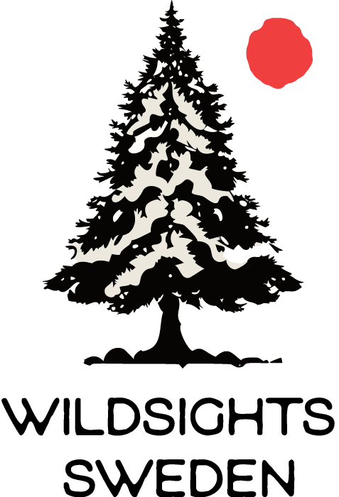
The First Logotype iteration
The First Logotype iteration
Our first approach was to create a logotype that directly communicated a "live" feel by using a simple red dot. The idea was to quickly establish a connection to live broadcasting.


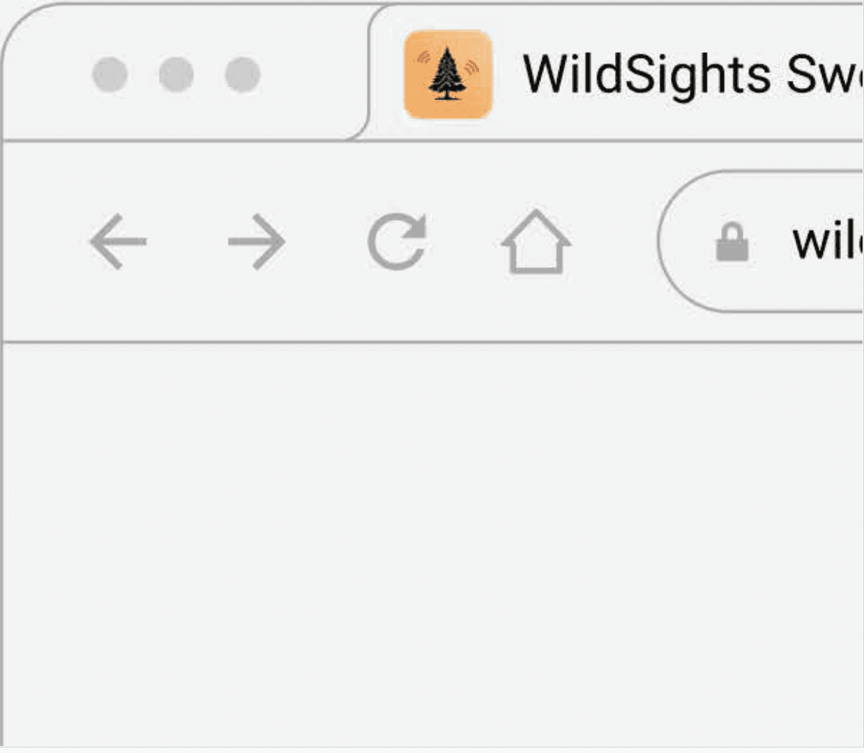
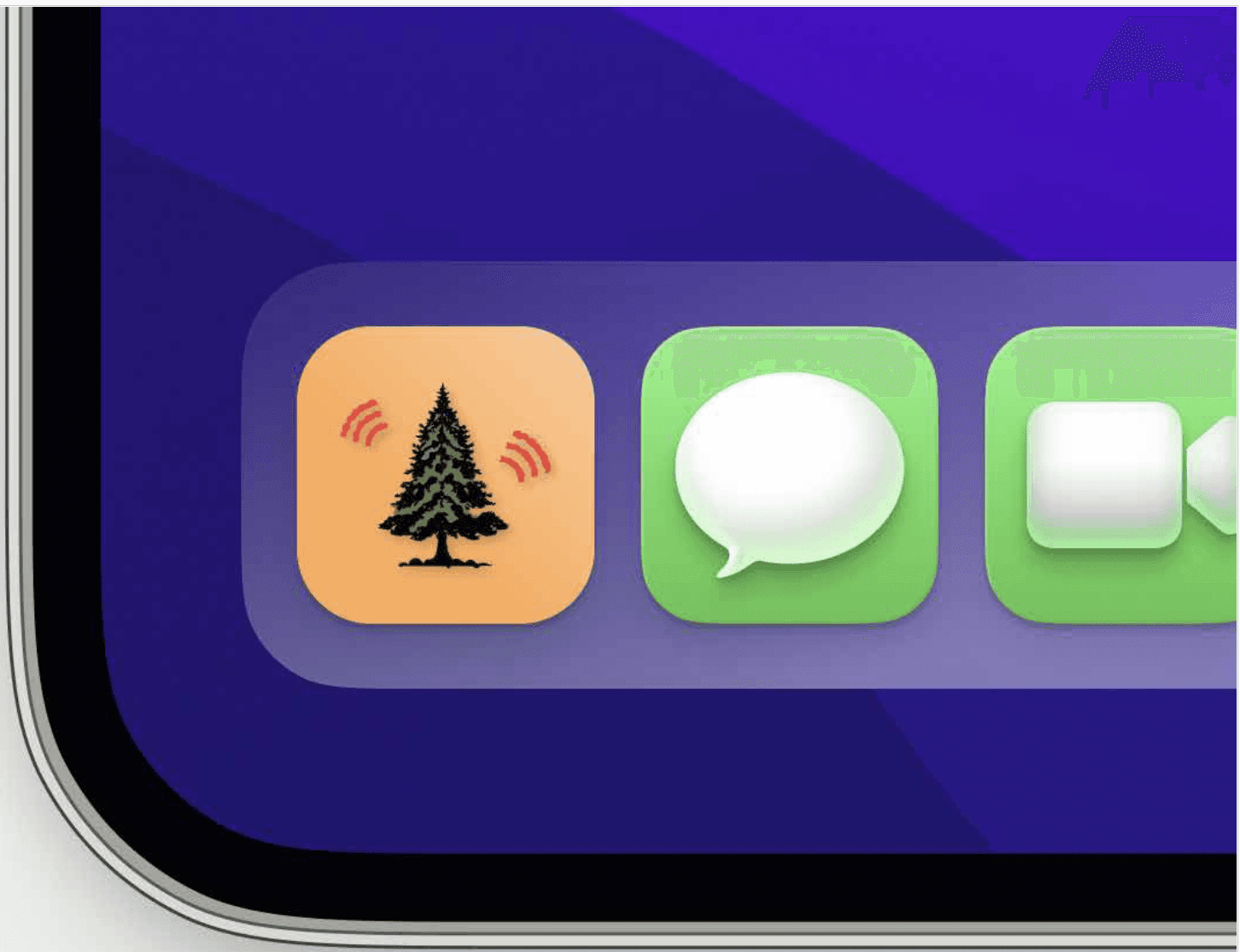
The Final Logotype
The Final Logotype
Through feedback and testing in various mockups, we realized the red dot wasn't clear enough. To more effectively communicate that the platform was for live-streaming, we iterated on the design and replaced the dot with a broadcast signal symbol. This change created a stronger and more professional link to the platform's core function.
Through feedback and testing in various mockups, we realized the red dot wasn't clear enough. To more effectively communicate that the platform was for live-streaming, we iterated on the design and replaced the dot with a broadcast signal symbol. This change created a stronger and more professional link to the platform's core function.
Key Design Elements
Key Design Elements
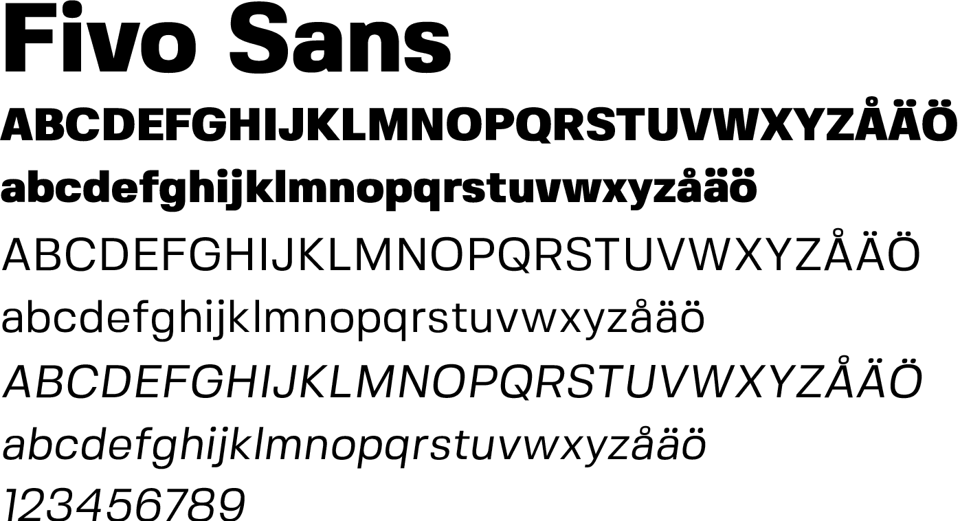
Typography
Typography
We chose two fonts to create a balanced typographic system: TEENAGE WORKHOOD for a unique, unconventional expression and Fivo Sans for body text and supplementary information.
We chose two fonts to create a balanced typographic system: TEENAGE WORKHOOD for a unique, unconventional expression and Fivo Sans for body text and supplementary information.
Imagery
Imagery
We combined the typography with imagery that blended nature and technology, creating a cohesive and interesting visual language that supports the brand's message.
We combined the typography with imagery that blended nature and technology, creating a cohesive and interesting visual language that supports the brand's message.


Key Takeaways & My Contributions
This project gave me a deeper understanding of the design process and how crucial it is to let it take its time. I have become more comfortable with the programs used and learned that feedback is one of the most valuable parts of a design project.
This project gave me a deeper understanding of the design process and how crucial it is to let it take its time. I have become more comfortable with the programs used and learned that feedback is one of the most valuable parts of a design project.
This project gave me a deeper understanding of the design process and how crucial it is to let it take its time. I have become more comfortable with the programs used and learned that feedback is one of the most valuable parts of a design project.
My contribution
My contribution
I created the video for the brand.
I created the video for the brand.
I helped create visualizations of the identity.
I helped create visualizations of the identity.
I participated in the development of the logotype.
I participated in the development of the logotype.
was responsible for creating the moodboard and developing the visual language.
was responsible for creating the moodboard and developing the visual language.
Explaniner
Let's make something cool together
Whether you're hiring, have a wild project idea, or just want to talk design over coffee — I'm all ears.
Designing by day, perfecting my Netflix queue by night. Based in Stockholm.
© 2025 Hampus Granqvist. All rights reserved.
Let's make something cool together
Whether you're hiring, have a wild project idea, or just want to talk design over coffee — I'm all ears.
Designing by day, perfecting my Netflix queue by night. Based in Stockholm.
© 2025 Hampus Granqvist. All rights reserved.
Let's make something cool together
Whether you're hiring, have a wild project idea, or just want to talk design over coffee — I'm all ears.
Designing by day, perfecting my Netflix queue by night. Based in Stockholm.
© 2025 Hampus Granqvist. All rights reserved.