 Resume
Shaping the Identity and Experience for 15 Minuter En Kvart
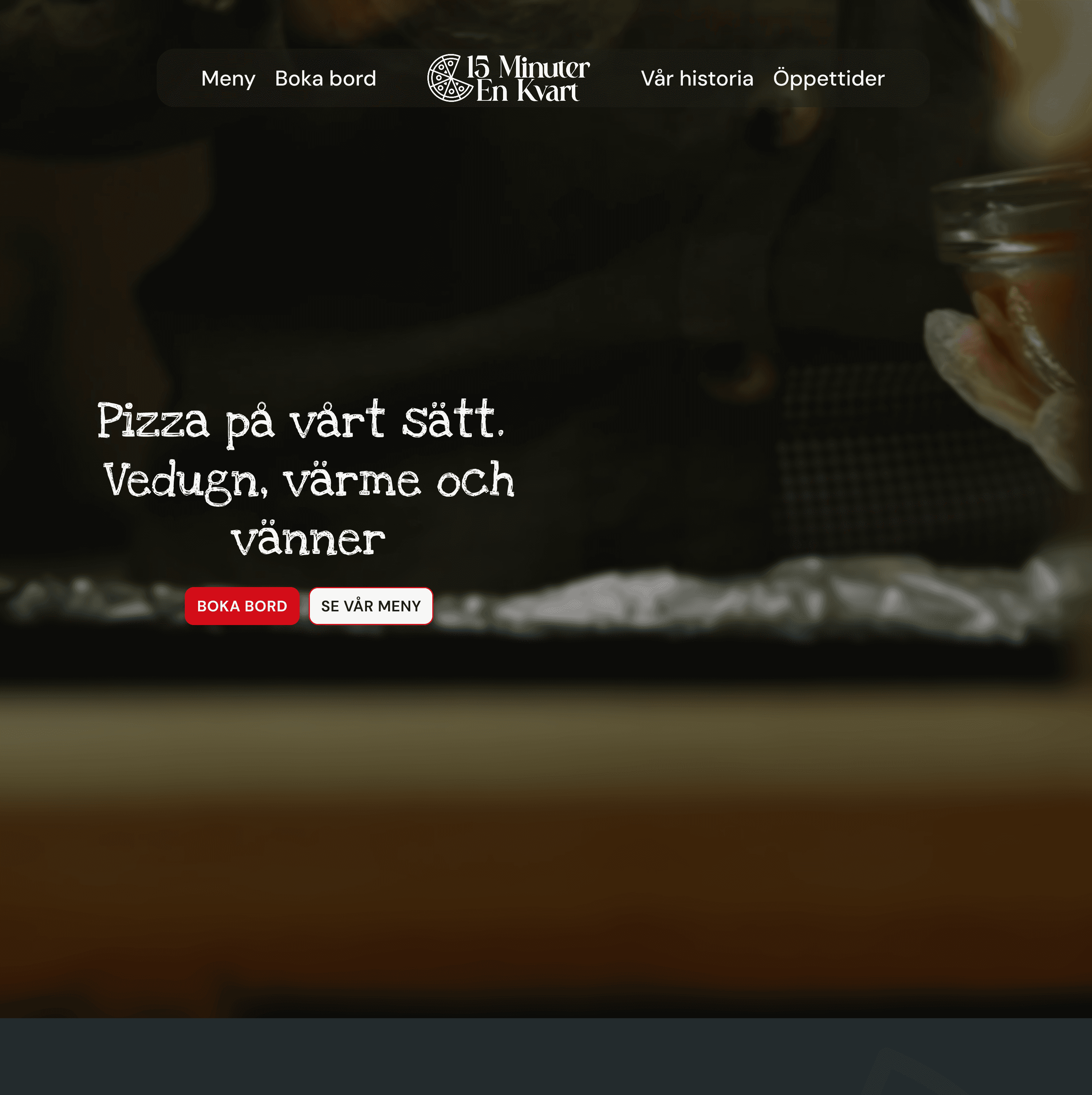
Bringing Fine-Casual Dining to Life Through Brand-Driven Digital Design
Role
Timeline
Tools
Figma
Overview
The target audience is adults aged 25–60 who expect to find what they need fast: menu, atmosphere, booking, without hunting through the site. For a fine-casual concept like this, the website isn't just informational, it's part of the experience. It needs to feel as considered as the food itself. That tension between visual ambition and functional clarity became the central design challenge throughout the project.
Give guests a clear picture of the concept, menu, and atmosphere before they visit
Design an interface that feels effortless, with everything reachable within two or three interactions
resent information fast enough to support a quick dining decision
Meet accessibility standards without letting them compromise the visual identity
Outcome
Simplified navigation made key information easier and faster to find.
Responsive design delivers a consistent experience regardless of screen size.
Accessibility improvements made the site more inclusive without compromising the visual identity.
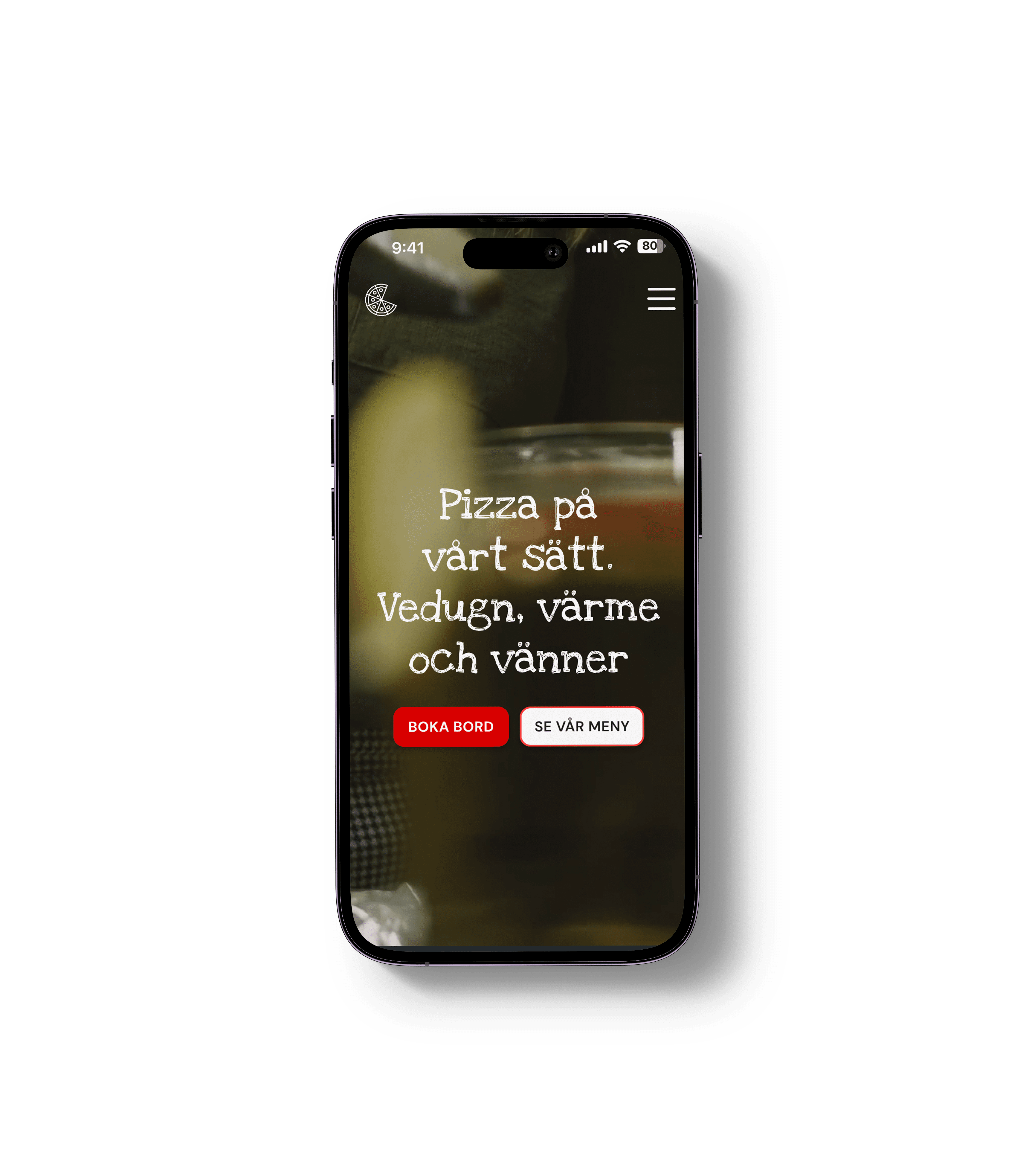
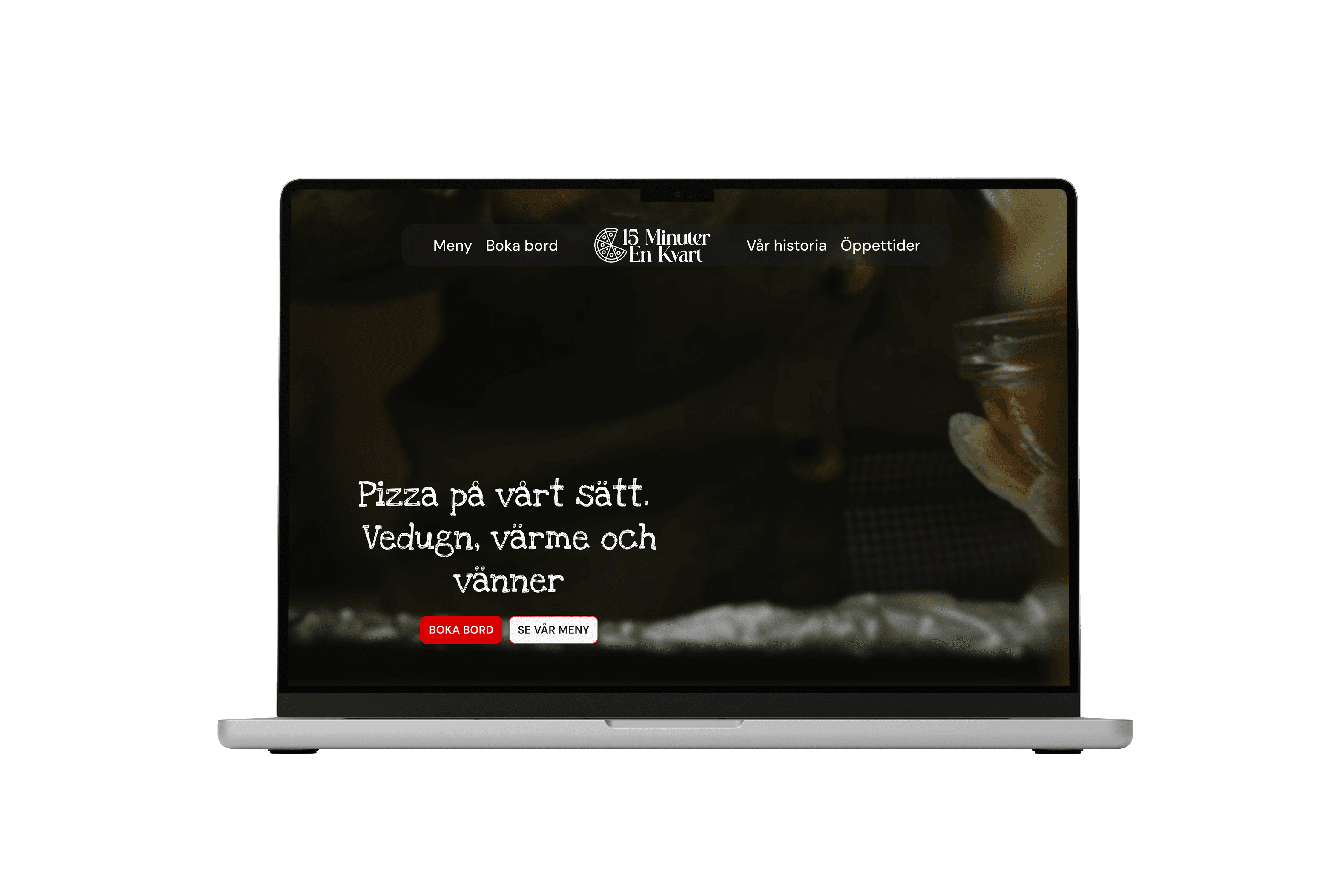
he final prototype brings together everything the project worked toward: a digital experience that feels true to the fine-casual concept of 15 Minuter En Kvart. Navigation that doesn't get in the way, visuals that sell the atmosphere, and a design that works just as well on a phone as it does on a laptop.
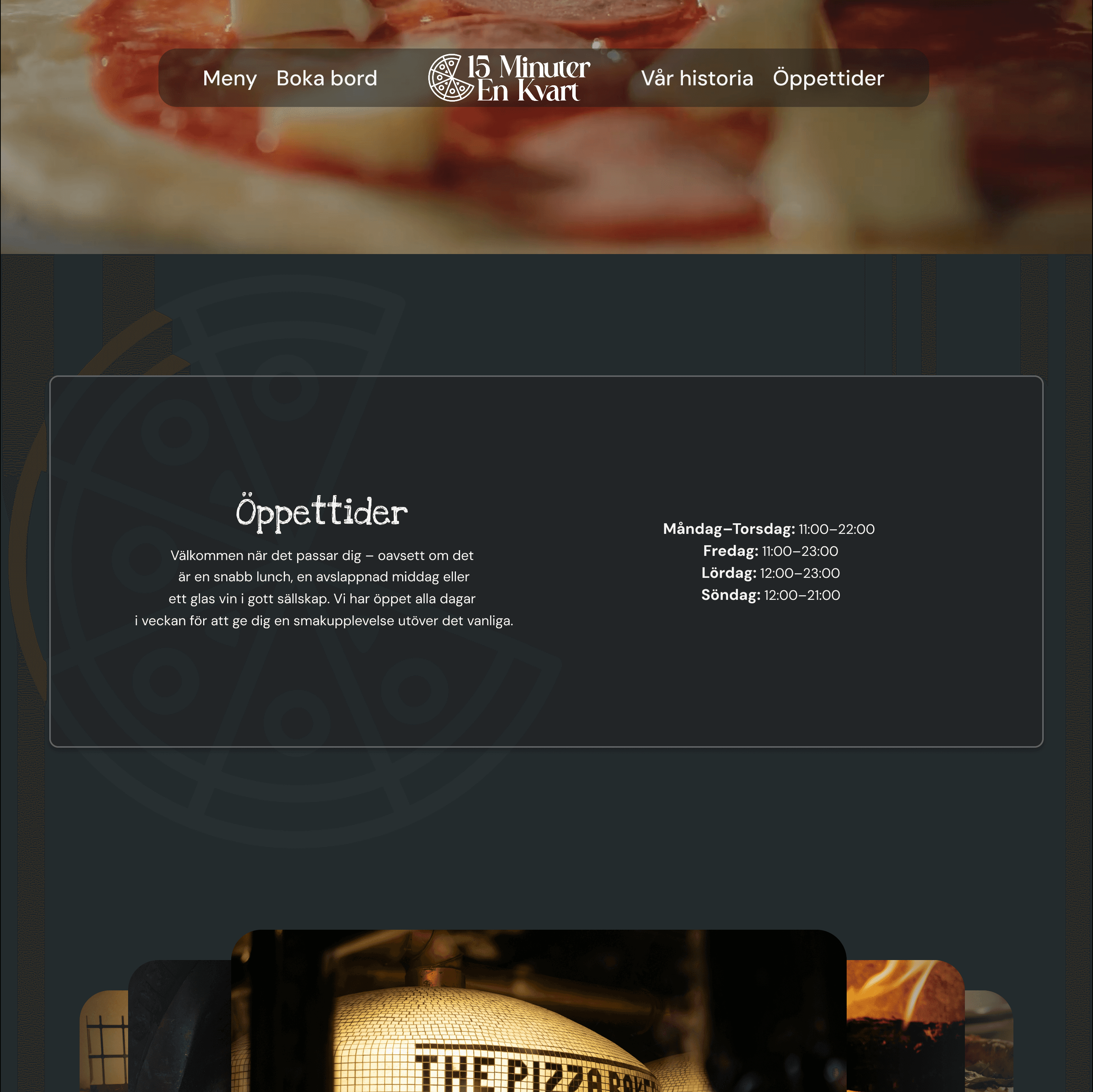
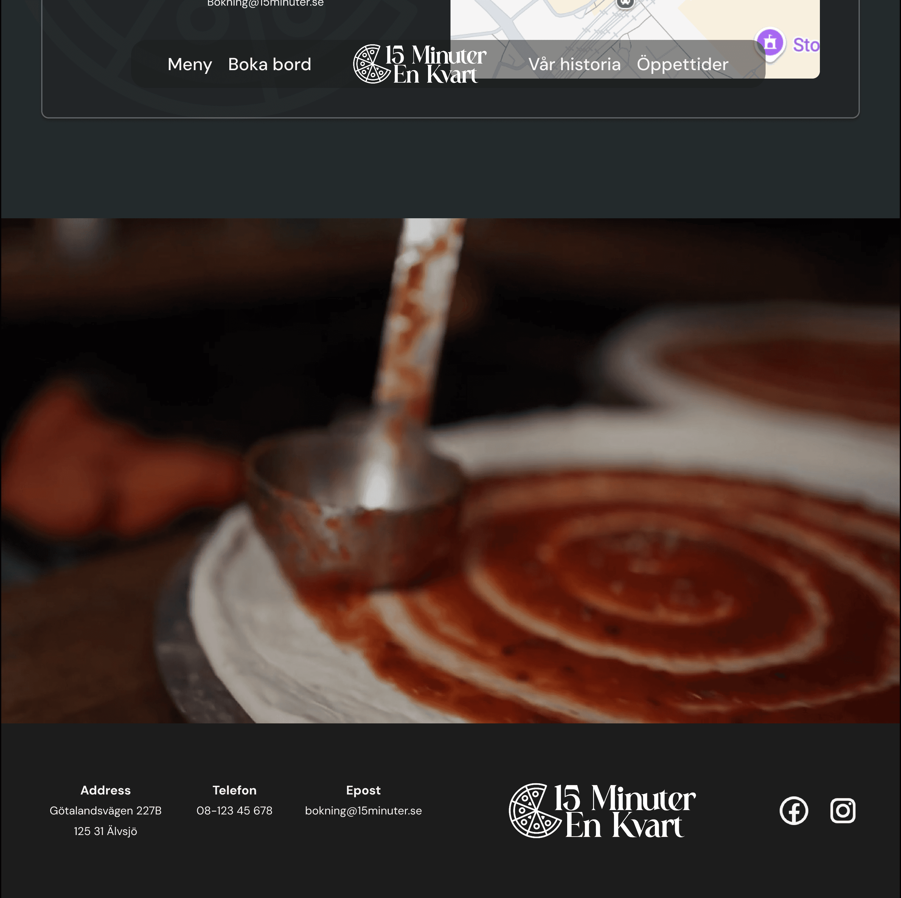
Navigation follows a clear hierarchy with visible cues throughout, so users always know where they are and where to go next. The layout adapts across desktop, tablet, and mobile without losing either the aesthetic or the functionality.
The visual style keeps elegance and simplicity in balance, with imagery and typography that communicate the restaurant's character without getting in the way of usability. High contrast, readable type sizes, and a logical content order make the experience accessible to a wider audience.
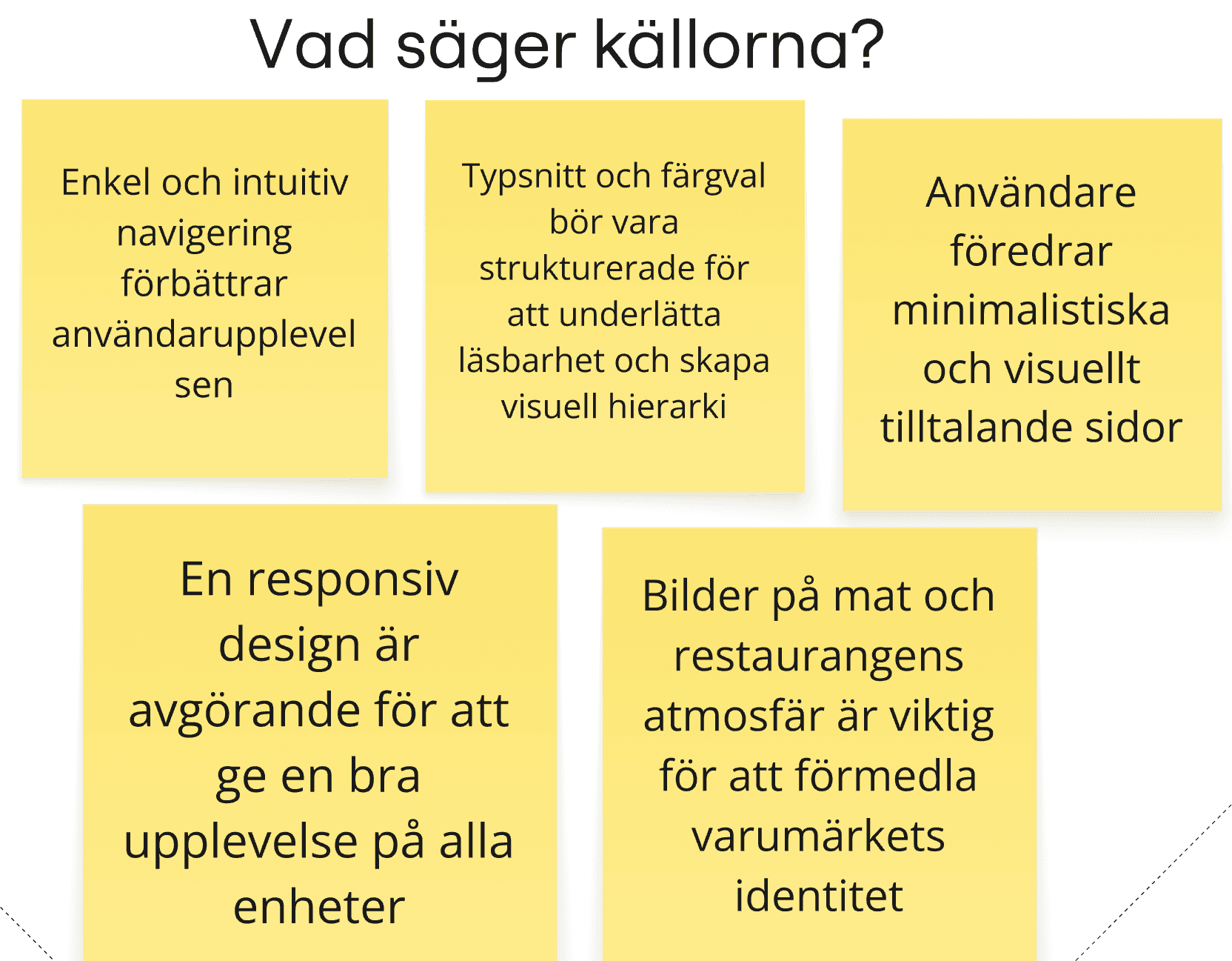
I started by mapping what actually makes restaurant websites work, and what makes people leave them. The research kept pointing to the same things: imagery that sells the atmosphere, menus that are easy to scan, and navigation that never makes you think. Mobile experience was non-negotiable. These became the pillars the design was built around.
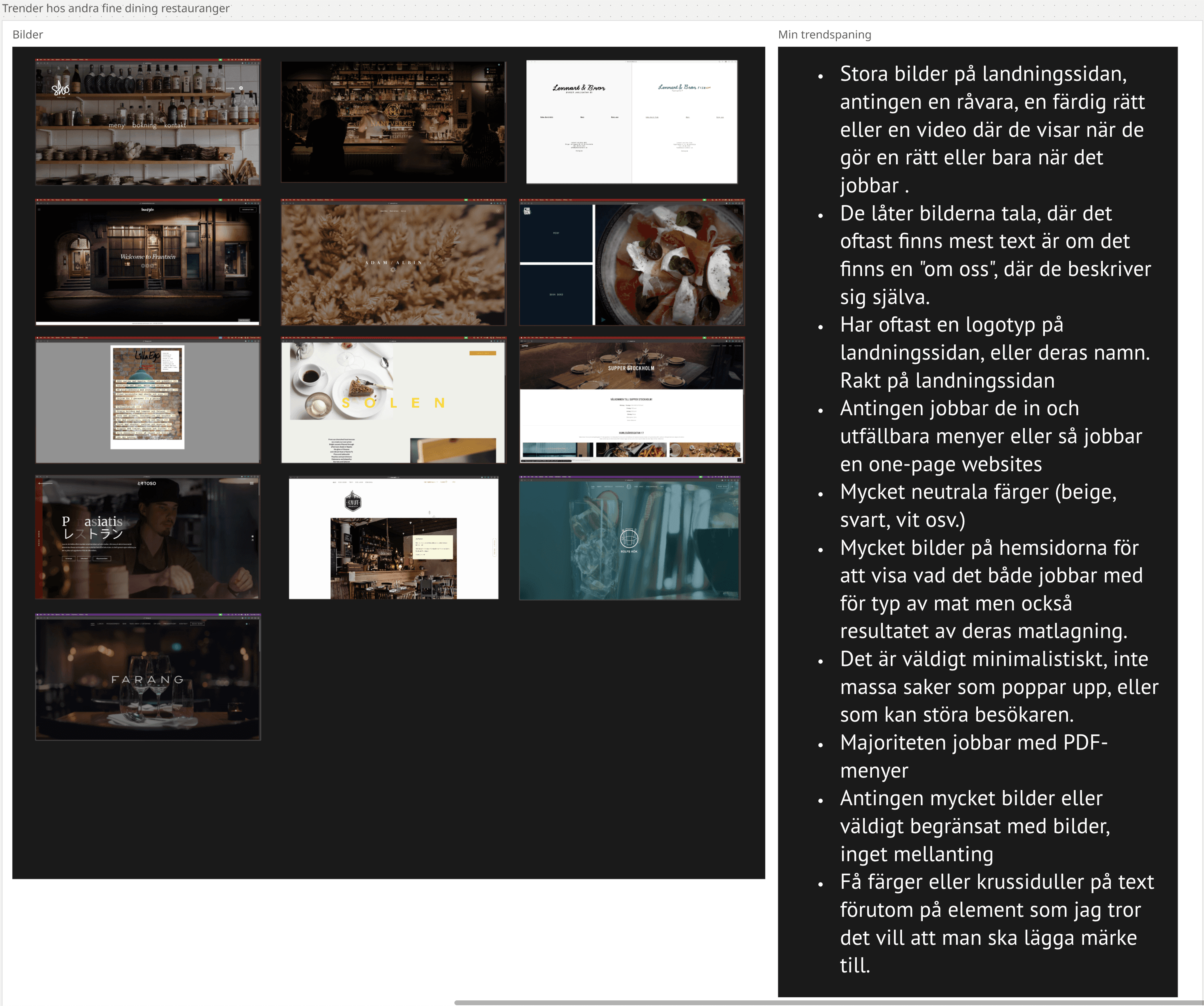
Looking at competitor sites, a clear pattern emerged. The weaker ones tried to do too much: cluttered navigation, generic imagery, no real sense of atmosphere. The best ones felt effortless, with one strong visual, a menu you could actually read, and a booking flow that didn't require three clicks to find. That gap in the market shaped the direction for 15 Minuter En Kvart.
Define
Using research insights and best practices as a base, I built an empathy map to get inside the head of someone deciding where to eat tonight. What are they hoping to find? What makes them bounce? Four clear design principles came out of it.
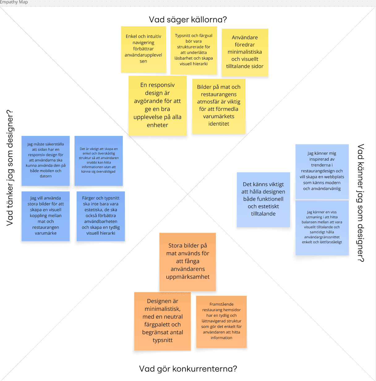
Key insights
Users want to find what they need without having to search for it.
Visuals should carry the atmosphere and brand identity, not just decorate the page.
The site needs to be readable and accessible for everyone who visits it.
The experience should feel consistent and considered across every device.
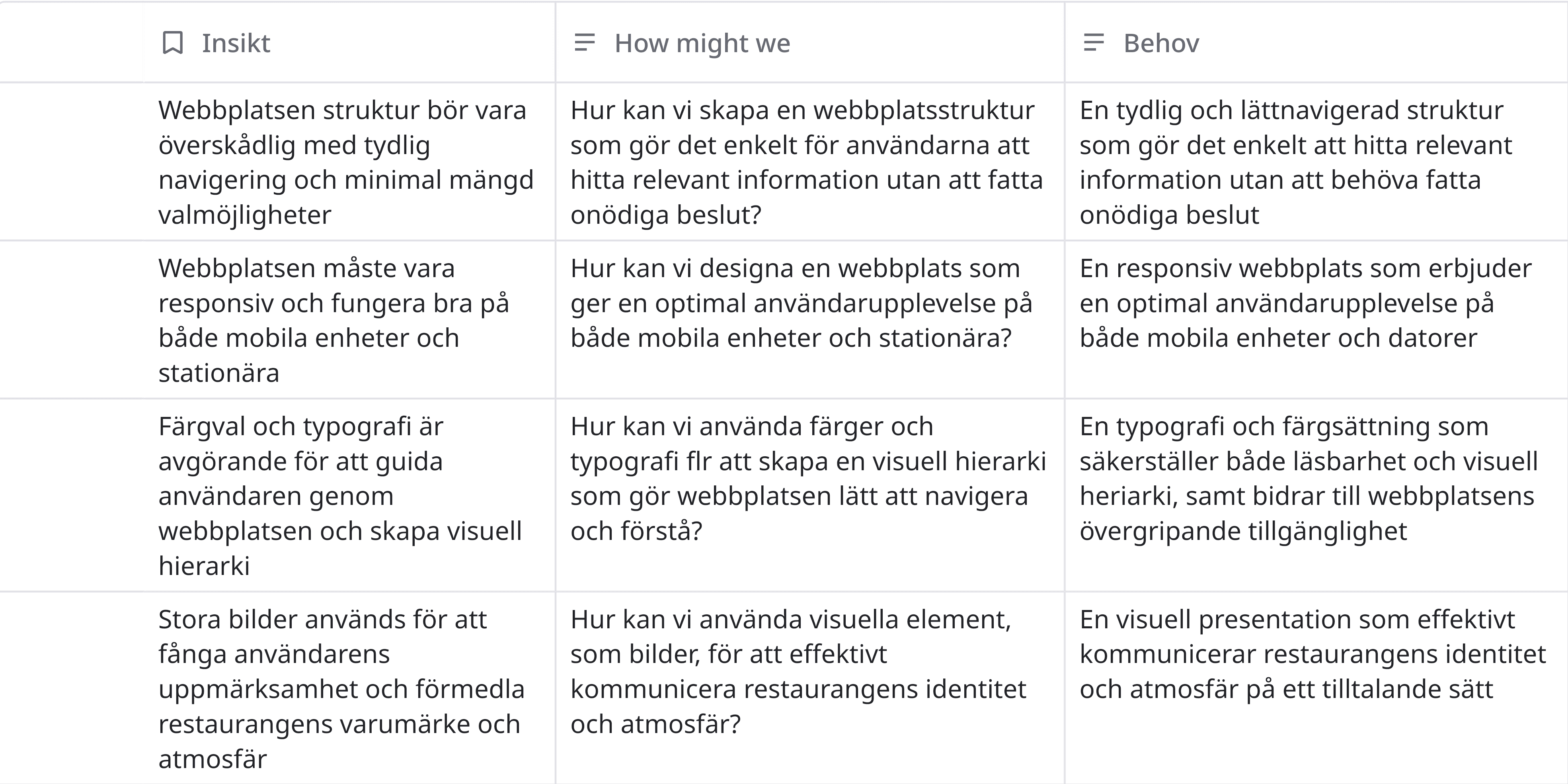
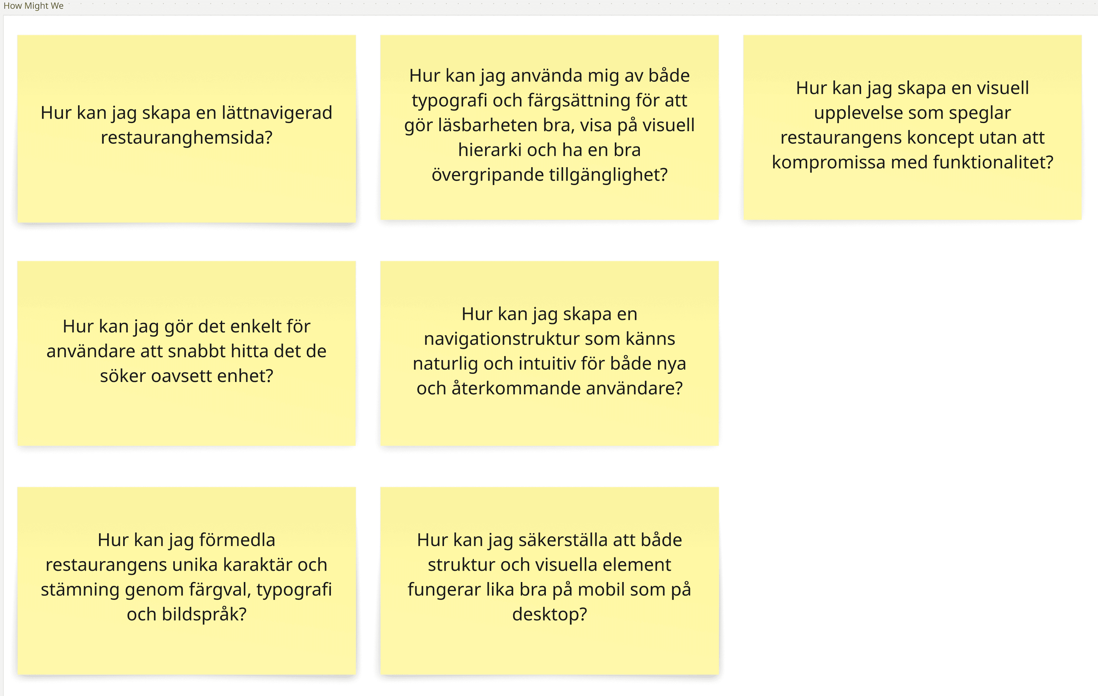
The empathy insights became a set of How Might We questions, a way to turn observations into design opportunities worth solving.
The main needs identified were
Navigation needs to feel intuitive without users having to think about where to go.
Imagery and layout should do the heavy lifting in communicating the restaurant's personality.
Text needs to be readable and meet accessibility standards across all contexts.
The experience should feel equally considered on mobile as it does on desktop.
From there, the questions converged into one overarching challenge: how do you design a restaurant website that communicates identity and atmosphere, works on any device, and stays accessible without ever feeling like it's trying too hard?
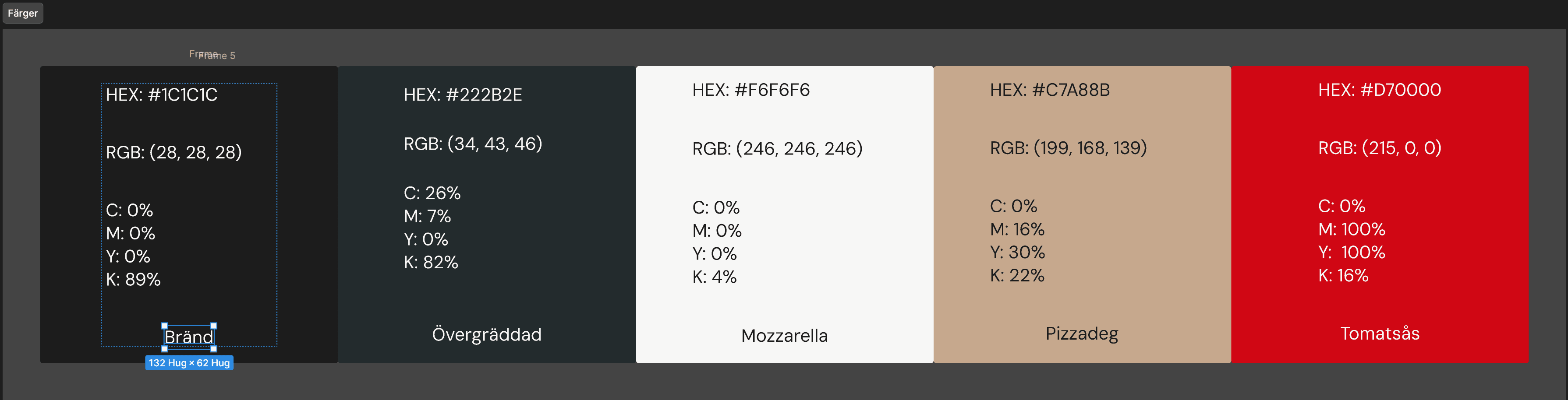
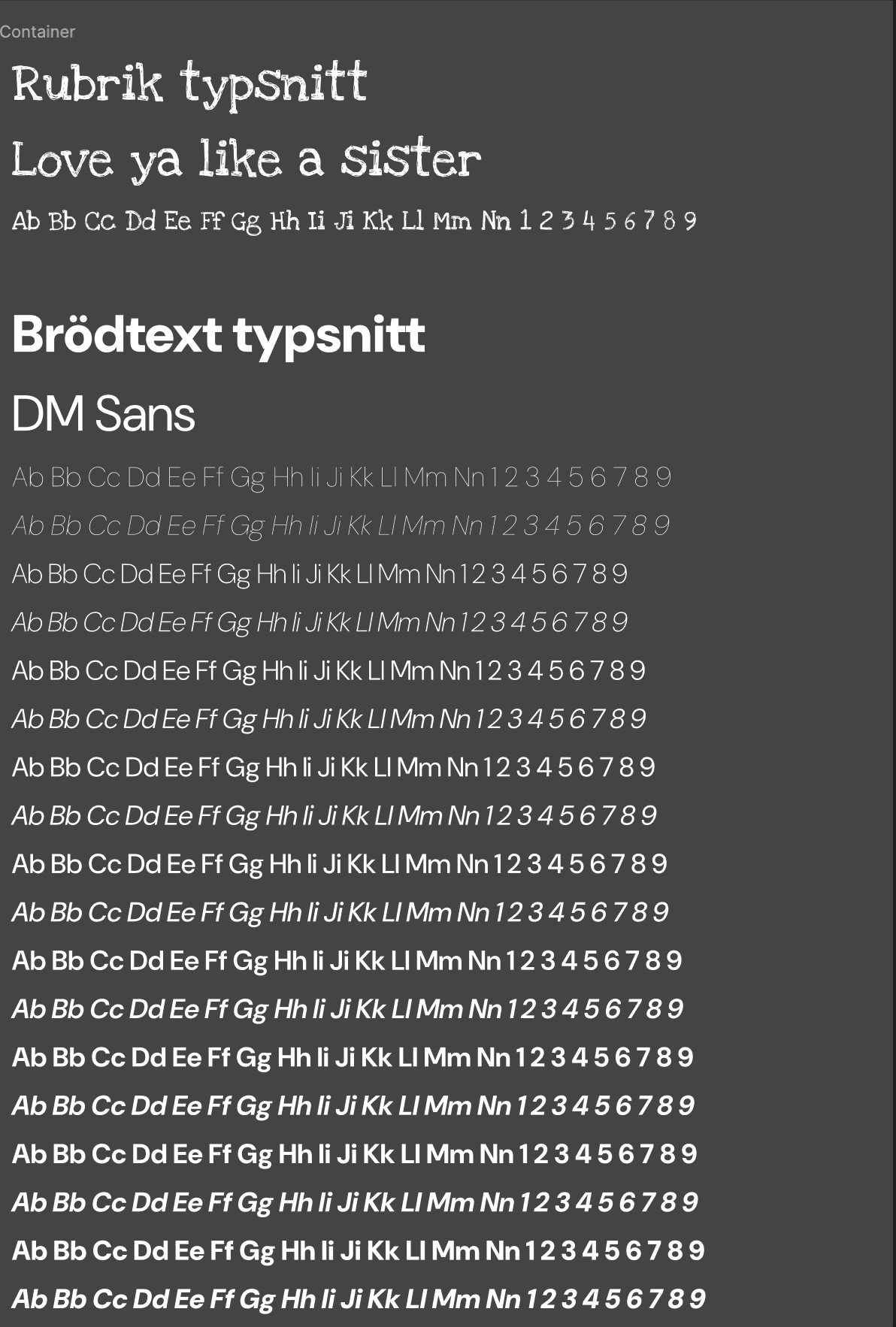
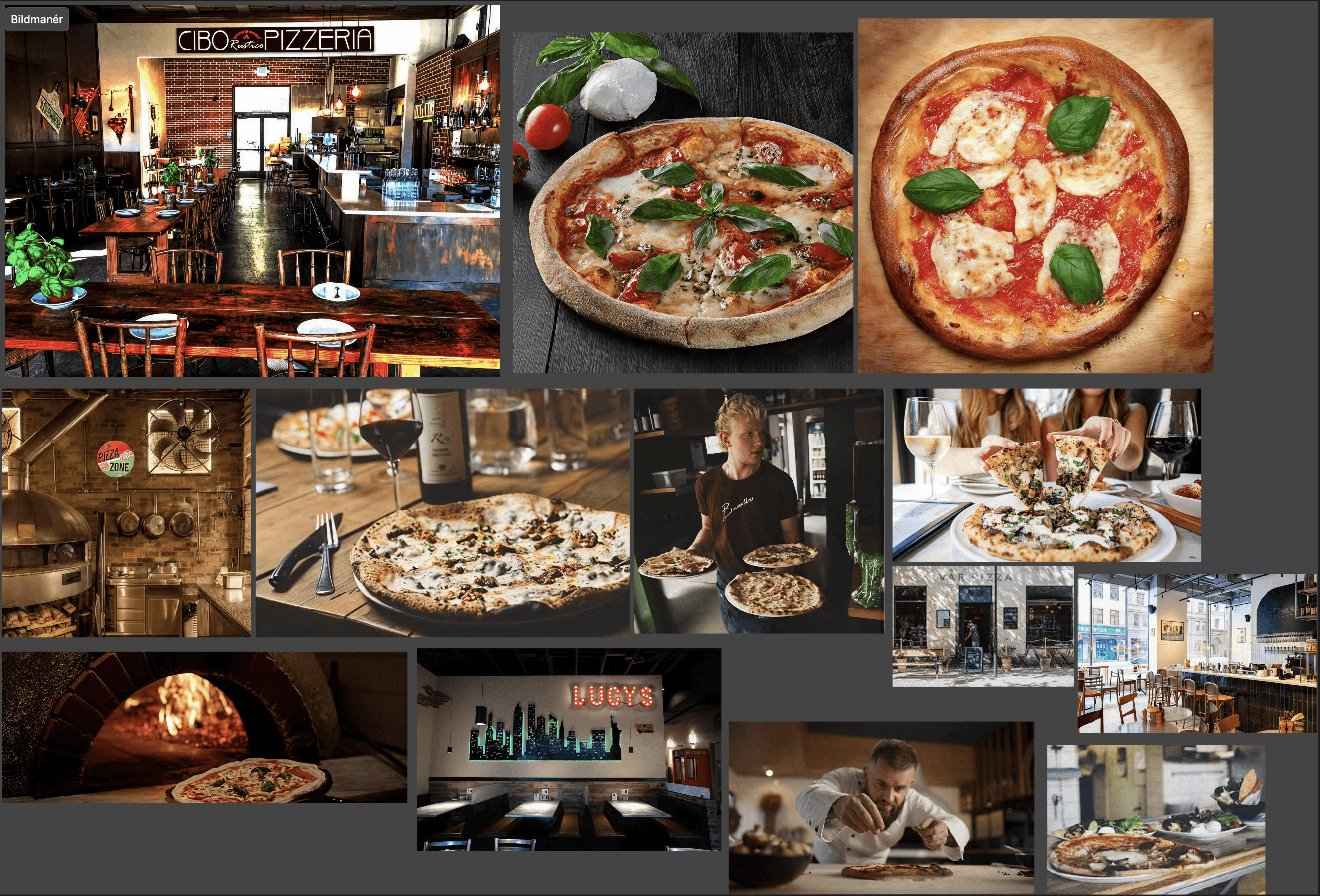
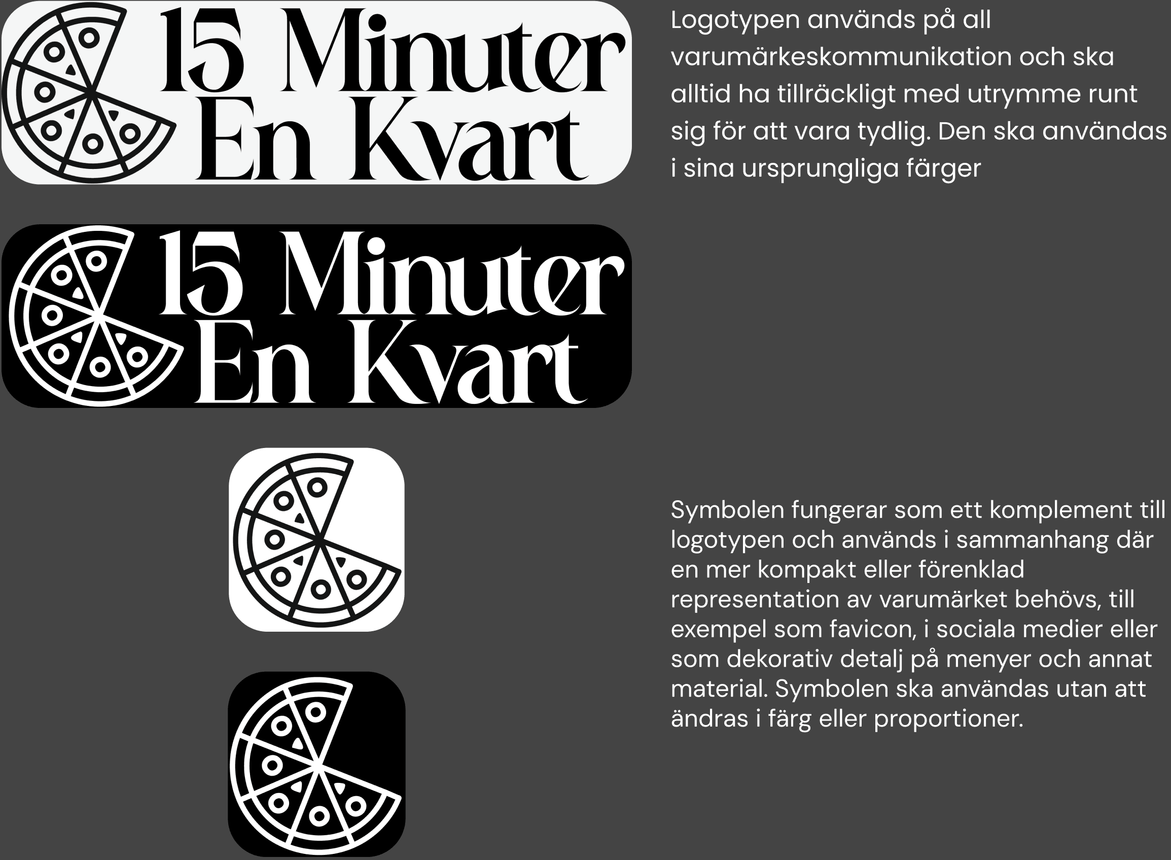
Before touching the interface, I built out the graphic profile: color palette, typography, and imagery direction. The goal was a visual language that felt warm and considered without tipping into pretentious. Everything in the prototype flows from these decisions.
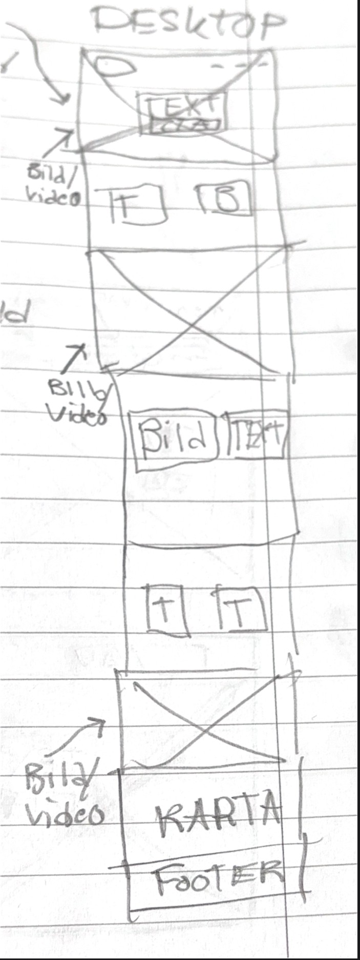
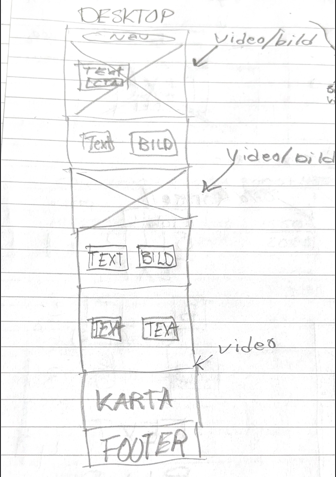
Sketching came before pixels, with quick and low-stakes exploration of layouts and content hierarchies. At this stage the goal is speed, not polish. Getting bad ideas out early so the good ones have room.
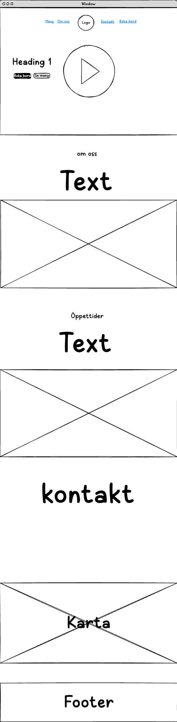
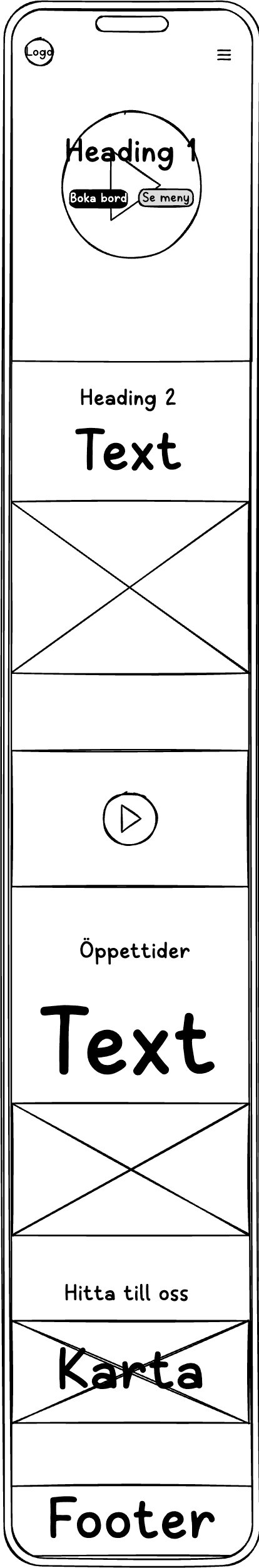
The strongest sketch directions moved into Frame0 as digital wireframes. Structure and usability took over from aesthetics here: how does the content actually sit on screen, on both desktop and mobile?
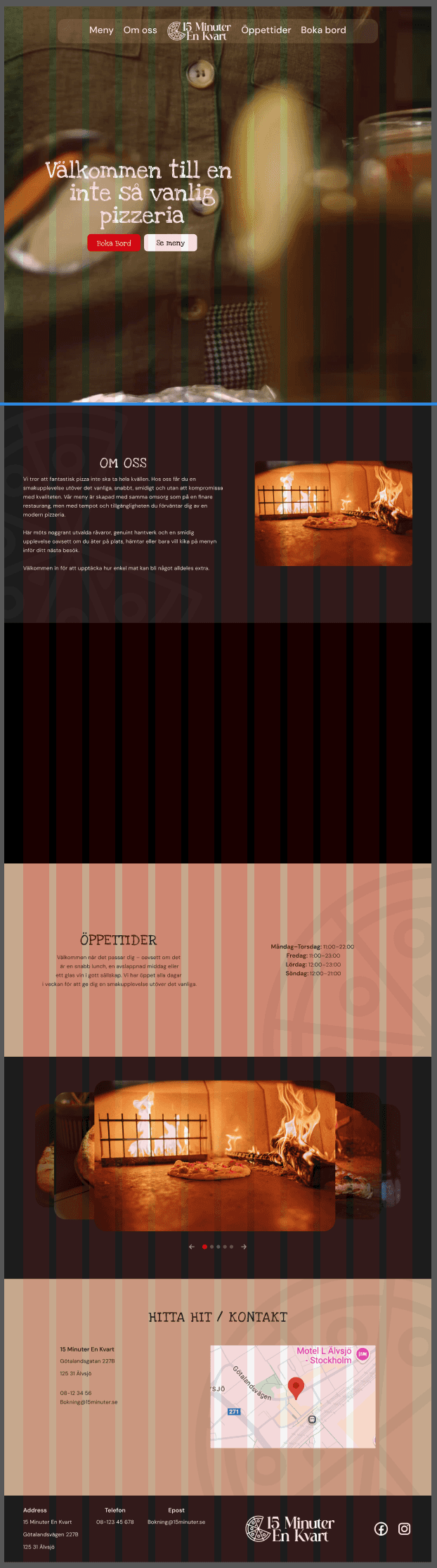
With the wireframes locked, I moved into Figma to build the first high-fidelity prototype with the full visual identity applied and fully interactive. Seeing the real colors, type, and imagery together for the first time always reveals things wireframes can't. This version became the basis for usability testing.
I ran think-aloud usability tests with the hi-fi prototype, watching real people navigate it and narrate their confusion in real time. Five clear issues came out of it.
Navigation felt unclear, with one tester questioning the logic behind the link order.
The confirmation page was noticeably brighter than the rest of the site, breaking visual consistency.
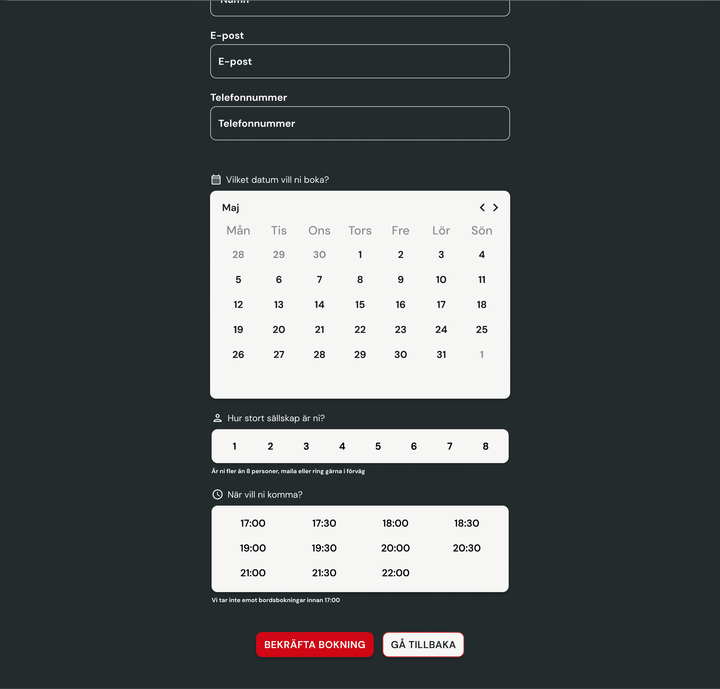
The calendar displayed dates from surrounding months, which confused users about which dates were actually bookable.
The color scheme lacked consistency across pages, causing visual confusion.
Button typography made text harder to read than it should be.
After iterating on the first round of findings, I retested with the same participants using the same method and the same tasks. Bringing back the same people means you're measuring real improvement, not just a fresh set of eyes.
The focus was on four things: accessibility, visual coherence, navigation logic, and content clarity. Had the changes actually landed?
Text near forms was too small, making key interactions harder to complete.
Related elements weren't visually grouped clearly enough, leaving users uncertain about what belonged together.
Four concrete changes came out of the second test: a unified warm background to fix visual inconsistency, card-style containers to clarify element grouping, muted styling for unavailable calendar dates, and updated typography across the booking flow. Small changes with clear improvements.